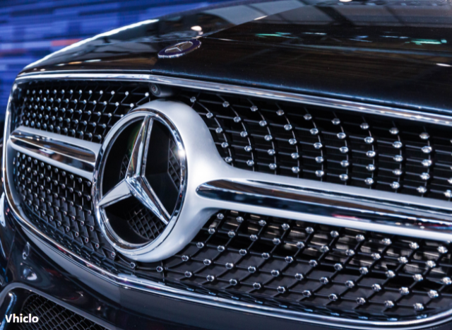
No announcement, no press event—just a silent shift. Mercedes-Benz has subtly redesigned its iconic three-pointed star logo, rolling out the new look without any formal communication. The update, implemented in February, replaced the familiar 3D chrome emblem with a minimalist flat, white version—so discreetly that many didn’t notice at first.
Contents
Where the New Mercedes Logo Appears
The revamped design now features prominently across the brand’s digital and corporate identity:
- Annual reports
- Social media platforms
- Email signatures
- Official letterheads
However, fans of the classic aesthetic can breathe easy: the traditional silver 3D star remains unchanged on physical components like:
- Vehicle hoods
- Steering wheels
- Wheel caps
Mercedes Remains Silent—But the Intent is Clear
While Mercedes-Benz hasn’t released an official statement, sources within the company suggest the move was intentional and internally managed. The goal? A more modern, streamlined, and digitally optimized brand image. The flat design is particularly suited for screens, enhancing visibility and consistency across digital platforms.
A Return to Simplicity, Not the First Time
This isn’t Mercedes’ first venture into flat logo design. Back in 2007, the brand briefly introduced a similar simplified version. However, in 2010, under then-CEO Dieter Zetsche, the company reverted to the 3D look, which was considered more prestigious at the time. Now, amid a broader trend where minimalism defines premium, Mercedes is giving the flat emblem another chance.
A Logo with Over 100 Years of Legacy
The Mercedes star dates back to 1909 and represents Daimler’s original vision: producing land, sea, and air engines. Over the decades, the logo has undergone numerous transformations—from a golden star to versions framed by laurel wreaths to today’s refined minimalism. Yet, the three-pointed star has remained a constant symbol of innovation and excellence.
Conclusion: A Bold, Digital-First Identity
The design update has sparked mixed reactions. Some see it as clean and forward-looking; others feel it lacks the emotional depth of its predecessor. Regardless, the message is clear: Mercedes-Benz is driving toward a digital, electric future—and its branding is evolving to match.
Automotive industry expert and editor of Vhiclo, specializing in car news, EV technology, and in-depth vehicle analysis. With years of experience in the field, Koutaibah provides trusted insights for enthusiasts and professionals alike.
